Are you drowning in a sea of data? Would you like to take control of your data and analysis to quickly answer your business questions and make critical decisions? Do you want to confidently present results and solutions to your managers, colleagues, clients and the public? Are you a champion of analytics in your organization helping others learn how to analyze and make sense of their data?
If so, The Accidental Analyst: Show Your Data Who’s Boss is for you!
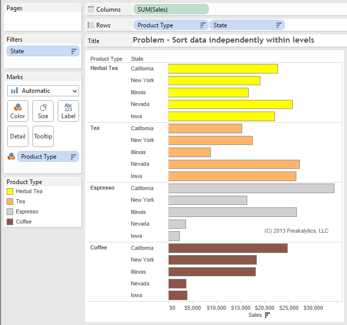
Many students have been confused about the Tableau data sort behavior. A common question is how to sort the data at a lower level correctly within each higher level of data in a view. One student recently came to us with this view and asked, “What’s up? I thought it would sort each state independently within each Product Type! In the first group, Herbal Tea, Nevada is clearly number one yet it is shown in the fourth position.”
Solution
I replied that Tableau was sorting Stateoverall across every product type once for the entire tableandthen displaying this sort order for every Product Type. She said this is “stupid, how can I fix it! I wasted hours trying to fix it already.”
Login to see the solution including a solution workbook! If you haven’t joined Freakalytics yet, it’s free and easy. Just click signup.
The 1st workbook walks you through building a standard Waterfall chart in Tableau. Waterfall charts are intended to show you how cash balances change over time based on transactions that either add to or subtract from the cash account of a business.
As this example demonstrates, many non-standard chart types can be created in Tableau using advanced features of the product. This chart type is a frequent request of students in our public and on-site Tableau training courses.
Joe Mako recently created a Tableau version of a Marimekko char inspired by an example from Jon Peltier, an Excel charting expert.
When I first saw this chart, I was curious as to the utility of this chart type for regular business decision-makers. I agree that for advanced analysts, it can offer a compact, contained means to present information across two categorical items (dimensions in Tableau) and metric (a measure in Tableau.) You can see this in the Marimekko chart created by Joe Mako in the left half of the dashboard below. When you examine the Marimekko chart you can see the dominant cities and the relative share of each segment within each city. You can also select the city names above the view to highlight a specific city. For example, you can easily discern that Almond Lovers are the biggest group of customers for this company and Delicious-n-new are the smallest group.
However, it is somewhat challenging to ascertain within Gainesville, FL which segment is the largest and smallest for this city. If you hover over each Gainesville, FL value in the original chart, you will see that two segments are identical in size; this is very hard to see without the hover values. This is due to the varying width and length dimensions for each tile in the chart.
Always leave them wanting more! –P.T. Barnum Creator of “The Greatest Show On Earth!®“ About our Presentation Length Calculator Creating compelling presentations that are clear and actionable are the lifeblood of successful analyst teams. Often, analysts have worked on problems for days or weeks and have much more material to present than is relevant or … Read more
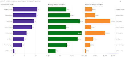
Using data from the first four seasons of the Shark Tank, Freakalytics has assembled a few fascinating insights for fans and potential entrepreneurs that may come before the Sharks in future seasons. While Barbara Corcoran is the most frequent investor. Mark Cuban is the investor with the largest amount invested and Mr. Wonderful invests the … Read more
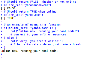
Whether you use R to access online databases in the cloud or want to scrape website data, it’s always better to check if you are online before throwing numerous error and warning messages. I wrote this function to work with no additional R packages required. Also, this function is fast and transparent about what occurs … Read more
You can have brilliant ideas, but if you can’t get them across, your ideas won’t get you anywhere. –LEE IACOCCA Engineer on the original Ford Mustang design team and CEO during Chrysler’s comeback in the 1980’s. From the Seven C’s of Data Analysis Framework Maria is a Senior Sales Analyst for an … Read more
At Freakalytics, we’ve used the D3 data visualization library on several client projects and have been impressed with the nearly infinite set of graphing, charting and mapping possibilities. Unfortunately, we were less impressed with the high learning curve, level of effort and complexity involved in developing and customizing the desired visualizations. Perhaps you have seen … Read more
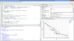
At Freakalytics, we frequently use R (often referred to as RStats) in our client projects and wanted to share our success using the RStudio Interactive Development Environment (IDE) with you. So, we created the RStudio® Keyboard Quick Reference by Freakalytics. It is available to you, compliments of Freakalytics, as a PDF and later in this article as a searchable data table.
The RStudio IDE was built by the team at RStudio to make you more productive in the R world. It is a free, open source application for Windows, Linux, Mac and UNIX desktop users. RStudio Desktop includes an interactive R console, a smart editor that supports direct code execution, graphing interfaces, code history, a debugger and project management for R code and related files.
In addition the PDF version, we are pleased to share online access to the RStudio® Keyboard Quick Reference as a searchable data table (click here to access the searchable data table in a dedicated window.) This searchable data table has all the shortcuts from the PDF -and- advanced shortcuts not shown on the PDF version (which is one-page for newer users of R).


 At Freakalytics, we frequently use R (often referred to as RStats) in our client projects and wanted to share our success using the RStudio Interactive Development Environment (IDE) with you. So, we created the RStudio® Keyboard Quick Reference by Freakalytics. It is available to you, compliments of Freakalytics,