 Bullet charts were added to Tableau in version 5.1. They are an original idea designed and advocated for by Stephen Few, at the University of California at Berkeley. The bullet chart is intended to enable easy examination of attainment relative to a target for categorical items.
According to Stephen’s original specification, “The bullet graph was developed to replace the meters and gauges that are often used on dashboards. Its linear and no-frills design provides a rich display of data in a small space, which is essential on a dashboard.”
I have shown the standard Tableau bullet chart and a wide array of variants in our public training course. Based on extensive attendee feedback, I will share how just a few minutes spent enriching your bullet charts will yield powerful enhancements for your dashboard audience.

This example shows profit by state (the blue bars or “bullets”) and whether the profit target was “hit” (the black line or “target”). An advantage of bullet charts is the ability to compare targets and sales amounts across the categories easily and quickly. Additionally, you receive additional context beyond whether the goal was achieved or missed, you can see if it was wildly exceeded or missed by a little or a lot.

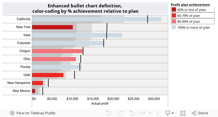
This enhancement to the standard bullet chart adds color-coding based on achievement relative to plan, a new calculated field. If achievement is 60% or less of the plan value, then the bullet is deep red indicating an area of significant under-performance. 60-79%, moderate under-performance, is colored red and 80-99%, approaching target, is colored light red. Any category (state) with sales at or over their target is colored blue. This contrast of darker red to lighter red against the less dominant blue draws your attention quickly to the worst achievers.
One additional advantage of the enhanced bullet chart is the ability to highlight categories at different levels of target achievement. This final example is an interactive version from Tableau Public, you can interact with it or download it for use in Tableau Desktop.
My experience introducing people to bullet charts indicates that a modest amount of time is needed to educate your audience about their interpretation and advantages. The original specification developed by Stephen can be found at http://www.perceptualedge.com/articles/misc/Bullet_Graph_Design_Spec.pdf. I have shared these enhancements with Stephen and I believe he will add them to the specification as additional chart variants when he updates the official specification