Dashboard tips by example- maps to inform, standard and novel approaches
Dashboards developed for clients frequently incorporate maps. Tableau offers quick, simple yet insightful mapping capabilities out of the box.
I have noticed that many maps used in my client’s dashboards attempt to display continuous measures. Examples include sales in the past quarter, year to date expenses versus budget or number of open sales opportunities. All of these metrics have shared issues in maps- a small range of the metric may be the dominant value in the display, making it difficult to differentiate amongst the values on the map. In this post, I will review some common and novel approaches to mapping this type of metric.
This examples for this post examine growth in US per capita income, from 2006 – 2008. I find this metric fascinating since it could be indicative of the locations that take the most and least amount of time to recover from the current recession.
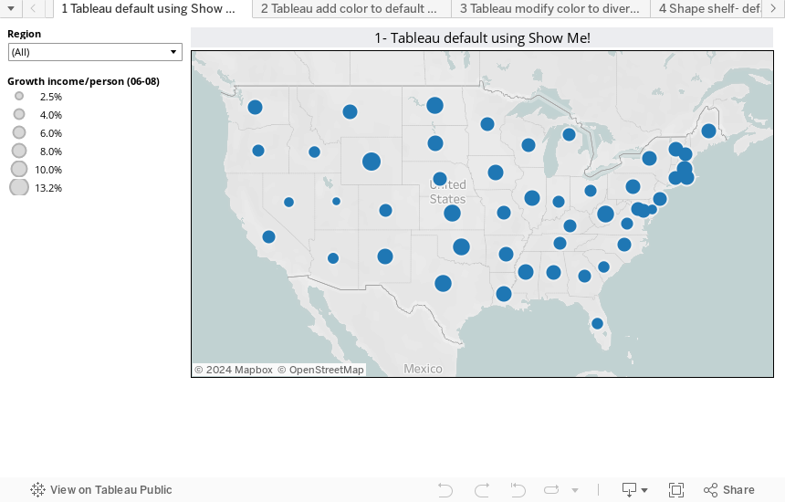
The first map uses Tableau defaults, with size as the primary encoding for growth rates. Reviewing the legend, it is easy to see that the metric has a range of 2.5% to 13.2%. Overall, a useful map.
NOTE- there are many interactive displays to load in this post, with slower connections it may take up to a minute for all of them to load.
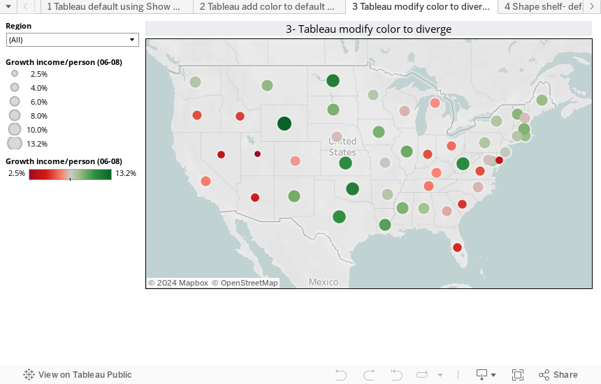
If you double-click the measure item Growth Income/Person (06-08), Tableau won’t add it automatcially to the view if it is already on the Size Shelf. By adding the same item to the Color Shelf, some additional clarity is added, but it becomes difficult to see the lower values, especially Utah.

With a simple modification to the Color Legend (double-click on the colors in the legend, click Advanced, click on Center), significant clarity is added. The lower and upper values stand out, which are often the major areas of interest.
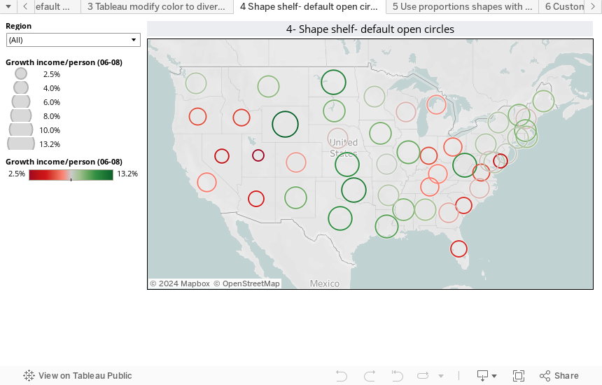
Changing the Mark type from Automatic to Shape changes the mark from a closed to an open circle. Size can be adjusted using the Size slider just below the Size Shelf. This change allows easier size comparisons and clarity in the Northeast where the sizes overlap.
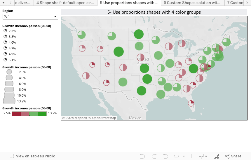
The Growth Income/Person item is added to the Shape shelf and the item type is changed from Continuous to Discrete. By manually assigning the values in 4 groups to Proportions symbols from the Symbol dialog, marks on the map appear in four shape groups, also known as quartiles. This change allows easy identification of values in understandable groups.
Each quartile has close to 25% of the states, even though some quartiles may cover a small range of values. The top quartile ranges from 9.5% to 13.2% while the next lower quartiles ranges from 8.4% to 9.5%- a difference in quartile size of almost 4X!
Modifying the color legend to use fours “Steps” approximates this effect, but doesn’t necessarily create 4 groups with equal numbers of states, like the manual quartiles above. The Color slider was also adjusted down from the max intensity, this enables overlapping symbols to be somewhat readable.
The steps in the color shelf simply divides the colors into 4 evenly sized metric ranges. Note that the Step effect from the Color Legend does NOT ensure that each group is of roughly equal count.
The light green color step contains 21 marks (states) while the upper green color contains just 6 marks. While useful, many students in our course think these steps are quartiles when 4 steps are selected.
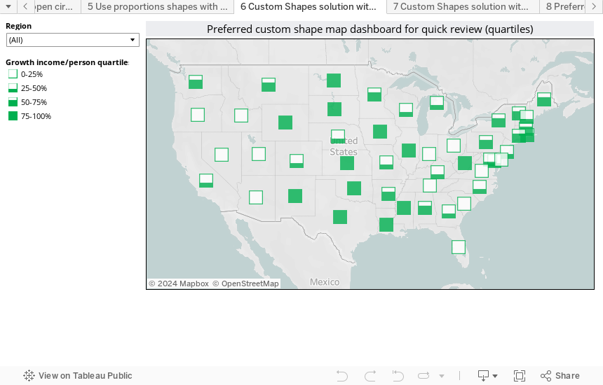
One novel solution is to create custom quartile shapes and use them to represent quartile ranges. I find this very simple, appealing and effective.
Growth Income/Person was duplicated, changed to a Dimension and then grouped into four (nearly) equal sized categories. Since the number of marks displayed, 49, is not divisible by 4 without a remainder, one of the groups must be larger than the others. However, the discrepancy in marks per groups will never exceed 1, if ties in the data values are ignored.
An added benefit of the grouping approach is the ability to use highlighting. Clicking on a state will highlight all other states in the same quartile group. By adding the Growth Income/Person data item to the Level of Detail shelf, the hover dialog for a state displays the exact growth rate in addition to the quartile.
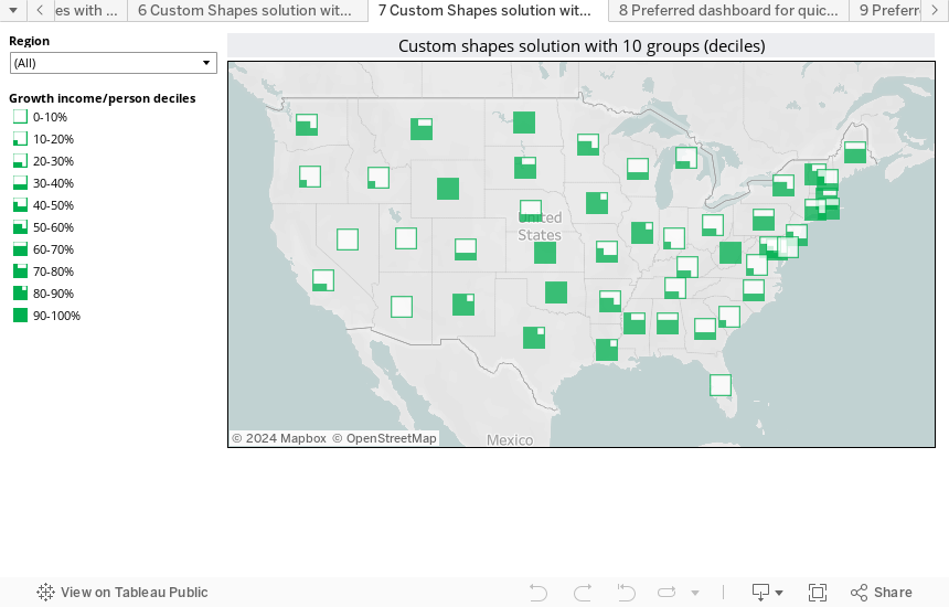
Another novel solution is to create custom decile shapes, allowing 10 groups for our metric of interest. I find this approach simple, yet it adds significant detail and it is also effective.
Growth Income/Person was duplicated, changed to a Dimension and then grouped into ten (nearly) equal sized categories. Since the number of marks displayed, 49, is not divisible by 10 without a remainder, one of the groups must be larger than the others.
An added benefit of the grouping approach is the ability to use highlighting. Clicking on a state will highlight all other states in the same decile group. Multiple deciles can be selected by CTRL + Left Clicking on multiple values.
I think that the quartile approach is more useful for a quick overview of the situation, while the decile approach permits a more detailed examination of the situation. Additionally, I think both approaches offer improvements over the standard capabilities in Tableau 5.1. Students in our public training are frequently amazed at the ease and speed of mapping in the current release. It is very nice that you can quickly go beyond the standard capabilities and customize the mapping shapes.