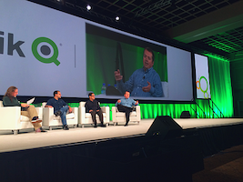
 At the Qlik World 2014 expert data visualization panel, moderated by Donald Farmer, Donald asked each panelist to offer up one of our favorite data visualizations for inspiration and learning.
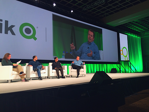
Alberto Cairo, Visualization at The University of Miami, offered up John Snow’s 1854 map of London that helped demonstrate that cholera was spread by contaminated water. Previously, many believed it was spread by noxious vapours or “bad air”.
By meticulously canvassing the St James neighborhood and collecting high-quality data, John Snow was able to convince the local authorities to disable the well at the center of his cholera victim’s map. The points are recorded overlaid on a contemporary map of the neighborhood.
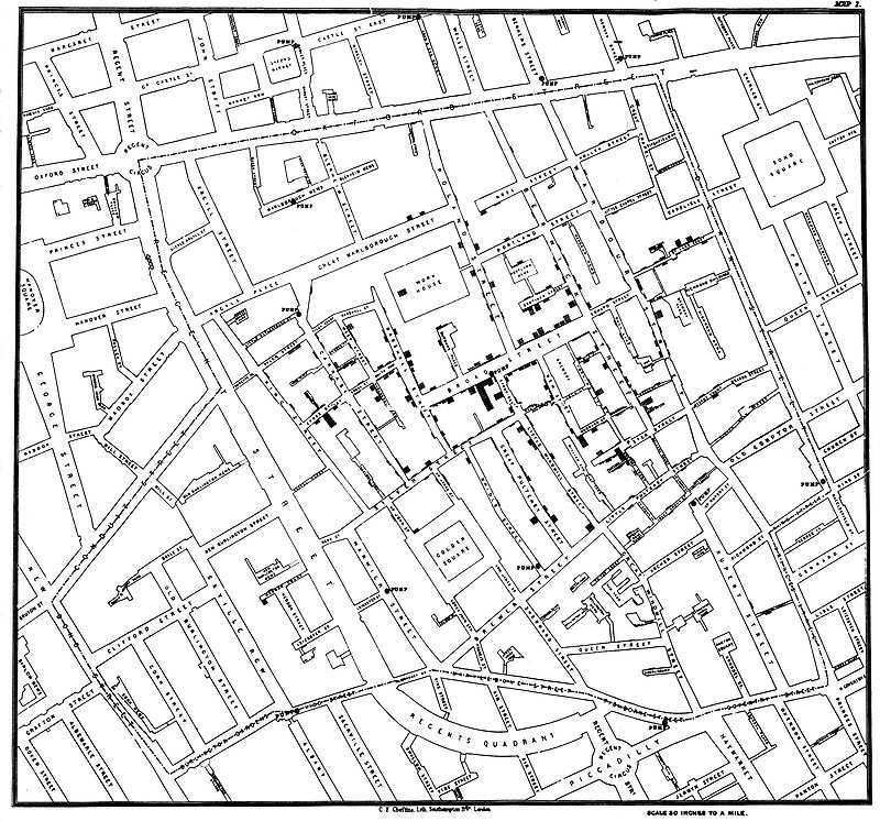
Read more about John Snow’s map and recognition of him as a founder of modern epidemiology.
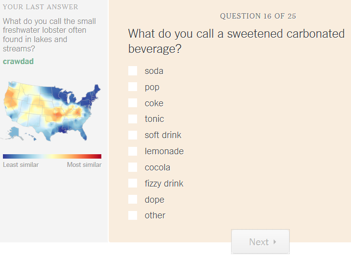
Kaiser Fung, Business Analytics and Data Visualization at NYU, cited a highly interactive work exploring the distribution of regional dialects in the United States, “How Y’all, Youse and You Guys Talk“. After answering a number of questions about how you would pronounce various words, this data visualization shows you the parts of the country that speak most similar to you. We really like that it gives you previews of your regional dialect based on the last answer as you complete the numerous questions – great motivation to keep you going!
Read more about the person behind this data-intensive and statistical model-driven approach to smart data visualization.
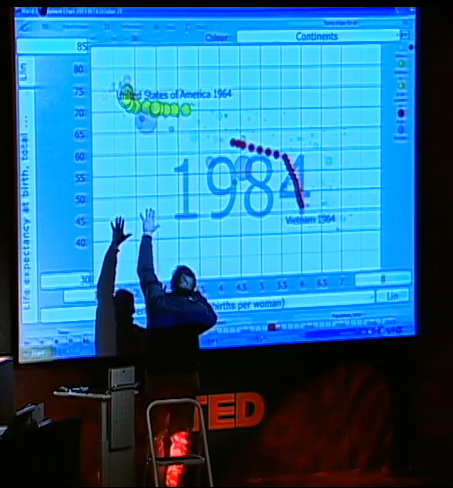
Stephen (of Freakalytics) cited Hans Rosling’s TED talk about myths and realities of people in the “developing world”. This talk is engrossing because he uses data visualization -and- his extensive work with this body of data to tell several surprising narratives that debunk many pre-conceived notions about the developing world (mistakenly characterized by many as the third world).
While people are impressed by the cool motion of the bubble charts and Hans’s passion about the topic, the real message is that storytelling doesn’t just happen by throwing up some charts. It’s about being knowledgeable about your data, the topic you are discussing and bringing forth thoughtful analyses to inform and spur your audience towards better actions.
Securely share R shiny apps
Develop R shiny apps
All on one dedicated, secure and powerful platform.